
A typography system built for editorial scale.
This study explores how a type system — two typefaces, a defined scale, and a set of usage rules — can carry an entire brand identity without relying on imagery or decoration.
Concept study — self-initiated, not a client commission.
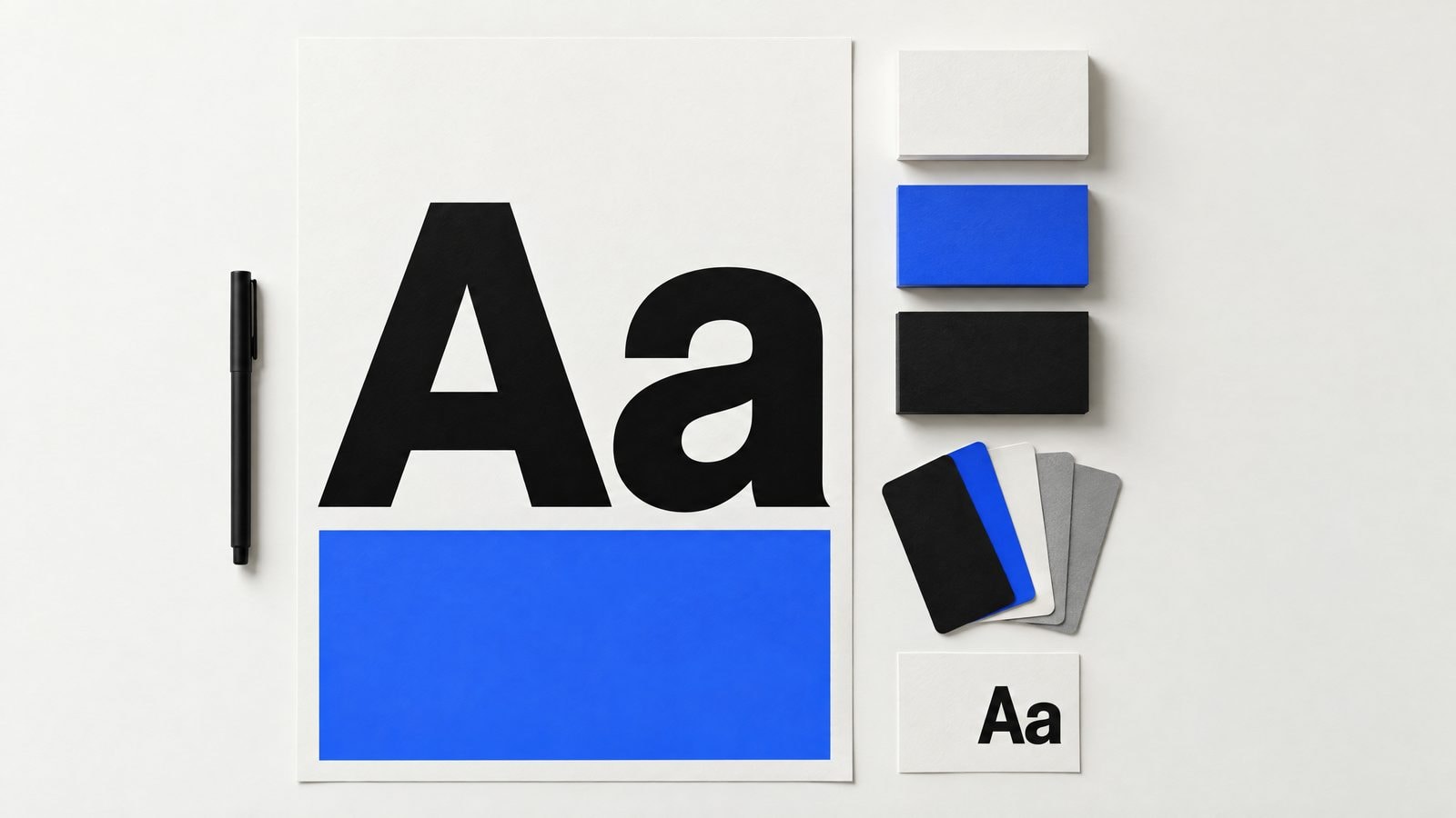
THE PROBLEM THIS EXPLORES.
Most brand identities lean on logos and color. When those are stripped away — in a text-only email, a plain-text document, a terminal output — the brand disappears. A strong type system means the brand survives any surface.
THE APPROACH.
Define the type roles
Every type system needs clear roles: display, headline, subheading, body, caption, label. Each role has a size, weight, line-height and tracking value. Nothing is left to interpretation.
Build the scale
A modular scale — in this study, a 1.25 ratio — generates every size from a single base. The result is a set of sizes that feel related without being mechanical.
Set the pairing rules
Two typefaces: one for display and headings, one for body and UI. The pairing rule is contrast — different enough to create hierarchy, similar enough to feel like one system.
Test at editorial scale
The system is tested at the extremes: a 152px display headline and a 13px caption. If both feel intentional, the scale works.
Document the rules
A type system is only useful if it can be applied consistently. The study ends with a one-page reference that any designer or developer can use.
THE TYPE SCALE.
Six roles. One ratio. Every size derived from a 16px base at a 1.25 modular scale.
THE COLOR SYSTEM.
Four roles. No decorative colors. Every value earns its place.
WHAT THIS STUDY FOUND.
A type system with six roles and a modular scale is sufficient to build a complete brand identity. The constraint forces clarity: every typographic decision has a reason, and the system is legible to anyone who works with it.
Field Notes
ONE USEFUL EMAIL A MONTH.
Practical notes on brand, websites, growth and AI from Numou AI.